

Humans are incredibly visual creatures: our eyes allow us to make all kinds of interpretations. How much are we affected by colour? We understand the symbolism of certain shades: orange cones alert to the need for caution, the hero rides in on a white horse, yellow tape, and rosy cheeks. But can colour really affect our mood? You may be surprised to learn that your interior design can determine how you feel – and when it comes to the biggest family gathering place, the kitchen, which hues should you dish up and which shades should see the chopping block?
Plausibility
Is it really possible that something as simple as a paint colour can affect your mood? Psychology says yes! In fact, colour has its own faction known as ‘chromology’, or the psychological study of colour. Advertisers and designers use this knowledge to determine which shades urge you to buy a certain brand or which wallpaper helps you sleep better in your hotel room.
At the University of Sussex, the Sussex Colour Group consists of researchers seeking to gather more information regarding how humans interpret colour culturally. One of their current projects looks at how we categorise colour with memory and judgements. With phrases like ‘green with envy’, ‘seeing red’, ‘feeling blue’, it’s easy to see how we use colour figuratively to bring meaning to our life.
Warm and Cool
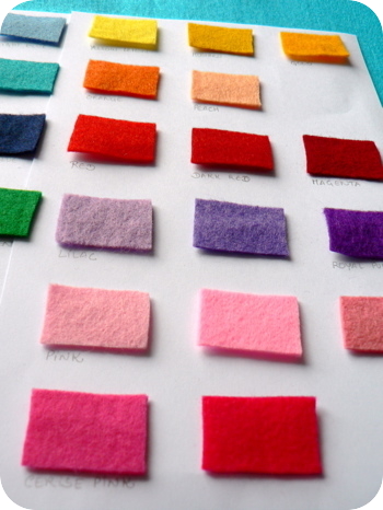
Just like the rainbow, our emotional range has a wide spectrum – no wonder our choice of paint can alter how we feel! Most colours are split into the cool (blues, greens, purples) or warm (reds, oranges, yellows) categories. While a neutral white is the simplest solution for interior design, it can make a room feel cold and sparse if it’s not complimented with furniture and accessories that bring a homeowner’s personality to the forefront of the design. Because of colour psychology, decorators often suggest cool colours for bedrooms, studies, and bathrooms – to encourage relaxation and a calming vibe for these more private areas of a home.
When you want to bring vivacity to gathering places such as the kitchen, look to the warm side of the colour wheel. Many restaurants incorporate red in their colour scheme because it promotes socialisation and is often noted for increasing appetite. Orange is suggested to aid in the digestive process. And, like the sun, yellow’s vibrancy is associated with energy. The kitchen is the centre of the home and brings people together, which is why many designers suggest using warm tones to evoke warm feelings.
Bits and Pieces
Before you feel pressure to coat your cabinets in fire-engine red, remember that sometimes our eyes are bigger than our stomachs. Kitchens are often chaotic places, and too much of these vibrant colours may lead to this important room feeling crowded and overwhelming. Design website, The Chromologist offers several tips for bringing colour into the kitchen with subtle touches. Painting one accent wall or even the floor can help disperse the energy while still promoting design and colour psychology. Even if you prefer neutral tones for your wall, bright cupboards, patterned window treatments, or an intriguing backsplash are methods of bringing colour in.
Tone it Down
Introducing a warm palette doesn’t mean you have to go straight for primary and secondary colours. Tone it down by finding earthy nods to reds and yellows. A Tuscan-inspired design makes use of ‘rusty reds and burnt oranges’ – just enough to stimulate those psychological associations but in a muted way suitable for cosy chats. The small details of a room – cushions, artwork, textures, and light – will also play a role in the overall feel of your room. Play around to see how different objects affect the vibe of your space.
Although a link between colour and our mood does exist – don’t let that be the ultimatum of your design. Mulberry Kitchens, kitchen designers in Norwich have commented that they have often seen their clients base their kitchens around a certain colour, but this is often an arbitrary decision. Although blue is known to suppress appetite, if that’s your favourite shade, using that colour in your kitchen won’t deter your guests if your design and attitude are welcoming. Just be aware that sometimes what you see really is what you get.